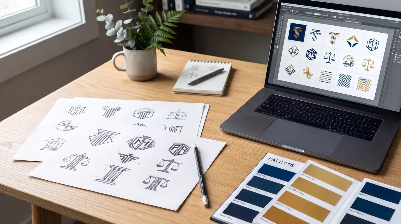
Your logo appears everywhere your firm does: the website, Google results, the office sign, letterhead, billboards, TV spots and the small icon on a phone screen. For a personal injury firm it is often the first thing someone sees before they decide whether to call. A good logo will not win cases, but a weak one makes a firm look generic or dated at the moment a prospective client is deciding whom to trust. This guide covers what makes a law firm logo work, the cliches to avoid, how to run the design process and the rules that apply.
What a law firm logo has to do
- Be recognizable. Someone who saw your billboard last month should know your sign when they drive past it.
- Be readable. Your firm name has to be legible at a glance, on a highway and on a phone.
- Fit the firm. An injury firm that wants to feel approachable needs a different look from a corporate litigation practice.
- Work everywhere. It has to hold up in full color, in one color, reversed out of a dark background and at very small sizes.
Wordmark, symbol or both
Most law firm logos fall into three types:
- Wordmark. The firm name set in a distinctive typeface, with no symbol. It is the simplest option and puts all the attention on the name, which is what people need to remember and search for.
- Lettermark or monogram. The partners' initials combined into a mark. It works well for firms known by their initials and is useful as a small icon, but initials alone are hard for a new client to remember.
- Combination mark. A symbol paired with the firm name. This is the most common choice because the symbol can stand alone where space is tight, such as a social media profile image or a website tab icon.
For most injury firms the name matters more than the symbol. People search for the firm by name and remember the name from ads, so make sure the name is the strongest part of the design.
The legal cliches, and when they still work
Scales of justice, Greek columns, gavels and courthouse facades appear on a huge number of law firm logos. They say "law" instantly, which is their appeal, but they also make a firm look like every other firm in the directory. If you use one, do something distinctive with it: simplify it, combine it with your initials, or use it as a small accent rather than the main idea. Many memorable firm logos use no legal symbol at all and rely on strong type and color instead.
Color
Navy, deep green, burgundy and gold are common in legal branding because they read as stable and established. That is fine, but it also means they blend in. Whatever you choose, keep it to a primary color and one or two supporting colors, and make sure the logo still works in plain black and white for documents and engraved signage. Check that the colors have enough contrast to be read easily, including by people with low vision, and that they look the same on screen and in print.
Typography
Serif typefaces feel traditional and authoritative. Clean sans serif typefaces feel modern and approachable. Either can work for an injury firm. What matters is legibility: avoid thin strokes that disappear at small sizes, script lettering that is hard to read quickly and very tight letter spacing. If the firm name is long, test it on one line and stacked on two, because you will need both versions.
Design for every size
Before you approve a logo, look at it in the places it will actually appear:
- The small icon in a browser tab and on a phone home screen.
- Your Google Business Profile and social media profile images, which are usually cropped to a circle.
- The header of your website on a phone.
- A billboard seen for a few seconds from a moving car.
- The end card of a TV commercial.
- Letterhead, business cards and the sign on your office door.
A good designer will give you a full version, a simplified version and an icon-only version, each in color, one color and reversed.
How to run the design process
- Write a short brief. Who your clients are, how you want them to feel about the firm, the names and colors of your main competitors, and every place the logo must work.
- Choose a designer with brand experience. Look for a portfolio with complete brand identities, not just single logo images.
- Review a few genuinely different concepts. Judge them at small sizes and in black and white before falling for one in full color.
- Get the files you will need. Vector files, high resolution images, color codes for print and screen, and simple usage guidelines.
- Make sure you own it. Your agreement should transfer the rights in the final logo to the firm.
Trademarks
A logo is part of how the public identifies your firm, so it is worth protecting. Before you commit to a design, search for similar names and marks used by other firms, especially in your state, to avoid confusion or a dispute later. Registering the mark can give you stronger rights if someone else copies it. A trademark lawyer can advise on the search and whether registration makes sense for your firm.
The bar rules
A logo is part of your advertising, so the lawyer advertising rules apply to it. ABA Model Rule 7.1, which most states follow in some form, prohibits false or misleading communications about a lawyer's services, and its comments address firm names and trade names. In practice that means a logo should not:
- Imitate a government seal or suggest a connection with a court or public agency.
- Imply a specialization or certification the firm does not hold.
- Use a trade name that misleads people about who the lawyers are or where the firm practices.
States differ on trade names and on details such as filing ads for review, so check your state bar's rules before you finalize the design.
When to refresh a logo
A refresh makes sense when the logo looks dated, does not work on phones and social media, or no longer matches the firm after a merger or name change. Plan the change across every surface at once, from signage to your Google Business Profile, so people do not see two versions of your firm. The guide to law firm branding covers how the logo fits into the wider brand.
The short version
A good law firm logo makes your name easy to read and easy to remember. Put the name first, use legal symbols carefully or not at all, keep the colors simple, and test the design at every size it will appear. Make sure the firm owns the files and the rights, consider protecting the mark, and check that nothing in the design misleads under your state's advertising rules.
Frequently asked questions
Should a law firm logo use scales of justice?
It can, but so do many other firms. If you use a legal symbol, make it distinctive or keep it as a small accent so the firm name stays the focus.
What colors are best for a law firm logo?
Navy, deep green, burgundy and gold are common because they feel stable. Choose a primary color and one or two supporting colors, and make sure the logo works in black and white.
Do I need to trademark my law firm logo?
It is not required, but registration can give stronger protection. Search for similar marks first and ask a trademark lawyer whether it makes sense for your firm.
Do bar advertising rules apply to a logo?
Yes. A logo is part of your advertising. It must not be misleading, imitate a government seal or imply a specialization the firm does not hold. Check your state bar's rules.
How often should a law firm update its logo?
Only when there is a reason, such as a dated look, a merger or a name change. Consistency builds recognition, so frequent changes work against you.
A Strong Brand Gets Remembered. Campaigns Bring the Calls.
A clear logo helps people recognize and trust your firm once they see it. Legal Leadz AI runs exclusive injury campaigns state by state and delivers each lead to one firm. Tell us the state and case types you want and we will show you what the volume looks like before you commit.
Get My Free Market Analysis →